1. Consistent branding
Your brand is the cornerstone of your business, and needs to be consistent across all touchpoints that your clients and prospects have with your business; including your website.
Your logo, colour scheme and iconography should inform the design of your website, which in turn should reflect and enhance your brand voice and key messaging to reinforce your value proposition.
2. Clear, logical design
According to research by Orbit Media, there are some common web design standards observed by the top 50 marketing websites. Including:
- Use of consistent web design standards: It’s no coincidence that most of the top marketing websites adopt a similar design approach, providing a sense of familiarity and certainty for visitors:
- Logo in the top left corner.
- Main horizontal navigation across the top of each page.
- Value proposition high on the homepage located ‘above the fold’. Some argue that there is no standard pixel height for browsers, and technically no ‘fold’. However, good practice is to include important design elements as high on pages as possible to ensure they are visible to the majority of visitors, with no or minimal scrolling.
- Images: The use of high quality images can greatly enhance your website. But they can also play an important role in the performance of yuor website and in getting your website found. As a minimum they should include:
- Optimise your images: If you are buying images from a stock library or are using your own images, the chances are they are several megabytes in size. It’s important to correctly resize your images, so they are no larger than necessary and as fast to load as possible. never copy photos from a Google search and always ensure you have the correct permissions to use the images across your website. Failing to do so can leave you open to hefty fines.
- The addition of ALT text: Images cannot be processed using screen readers unless an ALT text is used. Including an ALT text is an important strategy from an SEO perspective by supplementing your keyword strategy. ALT text can also be a helpful way to describe the image — important for search spiders and screen readers .
- Use images with human faces: People relate to people and authentic images with people tend to be more effective, than other graphics or animations, when engaging with visitors.
- Use responsive images: There are several affects that can be applied to images, including serving different sized images, according to the browser size, making them appear to grow or shrink on mouse over and applying parallax background effects which make the image appear to move more slowly than the foreground, gicing a 3D effect and sense of depth. These help with site speed, SEO and visitor engagement.
- Don’t forget about favicons. Favicons are small, iconic images, usually 16×16 pixels, which are used by web browsers to show a graphical representation of the site being visited. They display at the left side of the browser’s address bar and play a key role in enhancing the branding of your website.
- Element hierarchy: Hierarchy refers to the arrangement and order of design elements to showcase the relative importance of content. Structuring each page intelligently using visual contrast, size, and placements helps visitors identify the key messages being communicated. Using logical blocks help users distinguish sections from each other. This can be achieved through the use of content headers, which not only make it easy for users to skip to the parts that they want to read, but also break large amounts of text into readable chunks so that screen readers are able to determine the context of each section.
3. Mobile first
In 2020 mobile usage accounted for 61.8% of all internet traffic. The days of designing a website for desktop, with mobile being an afterthought are well and truly behind us.
- Google knows that 87% of smartphone owners use their devices to run an Internet search at least once per day.
- 58% of all Google searches are done from a mobile device
- The result: 70% of the first page results on Google are optimized for mobile devices.
It’s no more vital than ever that you optimise your website so the design and build is mobile-first and mobile-friendly.
Bear in mind that there are restrictions when designing for mobile. Screen sizes are smaller, and people interact with content differently than they do on a desktop. But, these restrictions are a good thing as they make for a more digestible website.
With mobile-first design, you ensure that you optimise every user experience, no matter how they engage with your content.
4. Intuitive navigation
To engage with website visitors you need to ensure they can easily find the content they’re looking for. Having a clear, logical website navigation is the first step to achieving this.
Website navigation is a general term that refers to the internal link architecture of a website., which helps users easily find relevant content on your website.
Your site’s internal link architecture forms the basis of your sitemap, which helps search engines access your content easier. A well-designed site where content is easy to find positively affects the website traffic you’ll get from search engines (along with a higher chance of getting Google sitelinks).
You can include the best quality content in your website, that solves your target audiences most complex problems, but if your visitors can’t find it, you will never reap the benefits of the hard work you’ll have undertaken in creating it. Your navigation and buttons should be clear and obvious so users can explore your content intuitively.
There are a number of ways to accomplish this:
- Clear language: Use simple, recognizable terms like “About”, “Services”, and “Contact” in your navigation. Don’t use jargon as it could confuse your users.
- Match your navigation to your content: If you have a website with limited content, you might only need a few navigation links to make a difference. With content heavy websites, you will probably need more complex navigation. Using descriptive mega menus give your users a clear path to find the information they need; especially when there’s a lot of available content.
- Set the navigational format: This might involve the use of a dropdown menu if there are several categories. Or a hamburger menu which is usually located at the top left or right side of the page. It appears as a square with three lines that can be expanded with a click.
- Breadcrumbs: Breadcrumbs track and display where a user is on a website. They let a user easily return to a previous page by retracing their steps. Breadcrumbs are especially useful for content-heavy websites and ecommerce shops.
Other tips for designing navigation based on web design best practices:
- Adding a search bar will help users easily find content (here’s how to design the perfect search bar for your website). This is especially useful for websites that have a lot of content, like a news blog.
- Design your site following the three-click rule, which states that users should be able to find desired information with no more than three mouse clicks. This is because users actually prefer navigating through a site rather than looking through the search results, when possible.
- Make your menu titles descriptive (with keywords in mind), which helps users find items easier and also positively contributes to SEO.
- The position of menu items matters. Put the most important pages towards the front of your menu so that they’re easily accessible.
- Keep menu items at a maximum of 7, not only to keep site design clean but also because having too many menu item categories can potentially affect your ability to rank in search. Google may interpret these seemingly unrelated categories as a sign that your website hasn’t decided on a specific niche.
- Include social media links. Social buttons are easy to incorporate into your design. Place them in your header, footer, navigation or body text to provide an easy for visitors to connect with you on various platforms.
- Add website chat or chatbots. One of the web design best practices is to make communication between your company and client simple and flawless. No one wants to make a call or fill in the form with multiple questions. Customers want immediate answers and control over the conversation. Using pre-programmed chatbots, or real agents enables website visitors to instantly engage in conversation and get immediate answers to their questions. You may choose between simple chatbots (that respond to pre-written words and commands), advanced chatbots (with the help of AI they can understand basic language and communication) and real-liufe manned chatb .
If you make it easy for users to navigate your website you’ll give them a deep, engaging experience, and a clear path to convert.
5. Clear Call to Actions (CTAs)
Your calls-to-action (CTAs) motivate your customers to convert, whether by purchasing your products, subscribing to your content or booking a call or appointment.
Let’s use Netflix as an example.
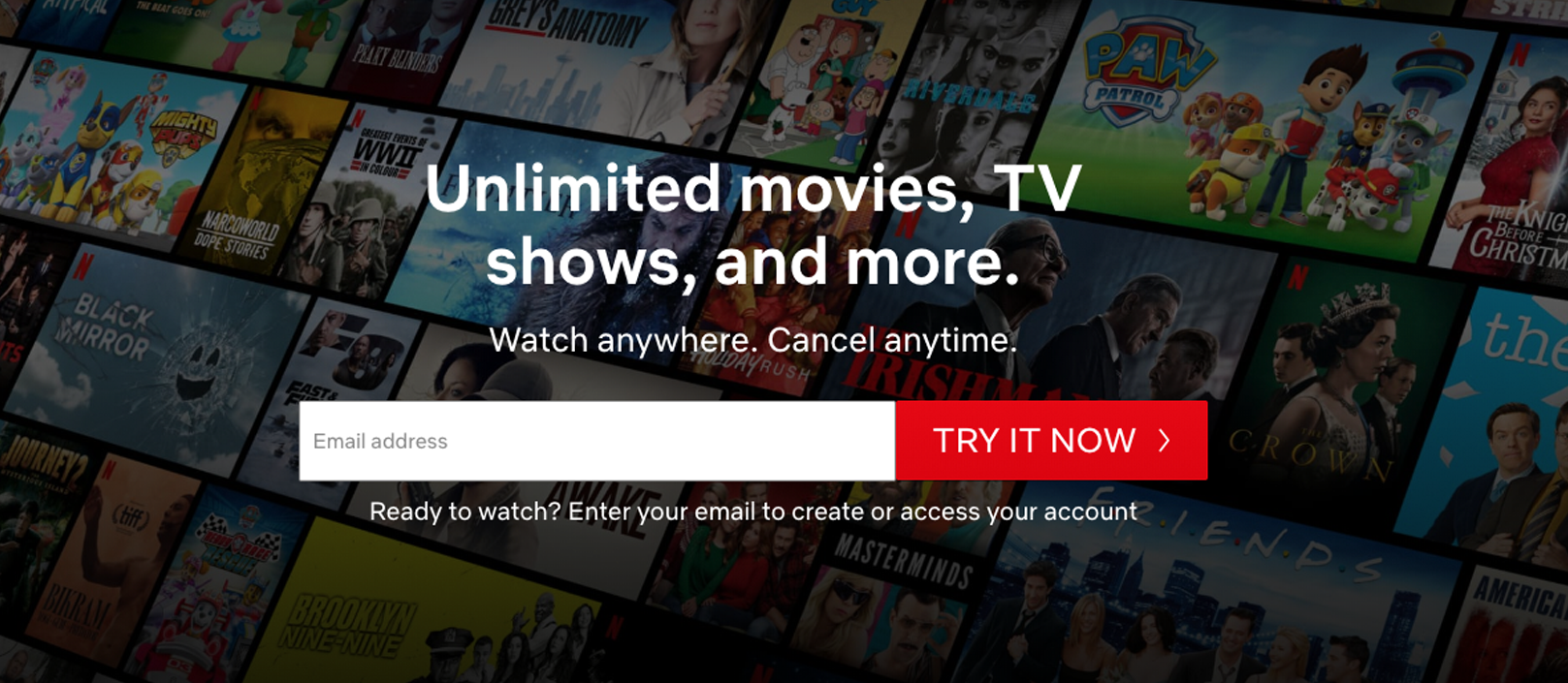
There are a few takeouts here.
- What’s being offered is immediately clear: The messaging is enticing users with unlimited movies and TV shows. The messaging sets the stage for the CTA.
- Potential objections are addressed right away: Users can cancel anytime.
- Bold, coloured CTA in a highly visible location: The CTA itself is instantly obvious. It’s coloured and unmistakable. To drive conversions, users can enter their email address to get started immediately.
Spur your users to action with a powerful CTA and you’ll see stronger results.
6. Storytelling
Stories are the most common way that humans make sense of the world and connect with one another. We all have insatiable appetites for good storytelling.
The very best stories deliver emotional impact. That’s one of the primary ways they break down barriers to engagement and understanding. That’s why you can connect more effectively with customers by leading with storytelling rather than with facts. And websites, in particular, can benefit by integrating brand storytelling and narrative techniques.
As an example: imagine a group of people traveling across rough waters. They’re on a quest to change the world but so much of what lies ahead of them is unfamiliar. And the journey is long and potentially treacherous. They need someone who knows those waters to help guide their ship away from danger and to safe harbour across the sea.
LoyaltyMATTERS is that guide: it’s our role to help our clients navigate brand, website, and product design. We know those waters well and we’ll help you cross them safely.
7. Accessibility
The internet was designed to work for all people, regardless of the specific hardware, software, language they use, their ability or location. However, many sacrifice accessibility for a beautiful design.
Access to information is a basic human right, which has been recognized by the UN Convention on the Rights of Persons with Disabilities. Besides that, making your site accessible has positive effects — not just on sales but SEO as well. W3C shares a basic list of standards you need to follow to design an accessible website.
Accessibility means designing websites and applications that can be used by individuals who have visual, motor, auditory, speech, or cognitive disabilities.
An easy way to make your website more accessible is to install the WP Accessibility plugin, which adds accessibility features including:
- A toolbar where users can resize fonts and view your site in high contrast and grayscale.
- Comparing color contrast to check if it fits the standard of the ADA.
- Removing title attributes from images inserted into content. Most screen readers aren’t able to sense this and read the anchor text instead.
- Enabling skip links, which are internal page links that allow users to skip directly to the content, which is useful for people using screen readers.
A few additional steps to take:
- Add subtitles or a transcript if your site produces media such as audio, audiobooks, videos, podcasts, and so on, to benefit the deaf/mute, as well as people who want to consume your content but cannot consume media in public.
- Use contrasting colours: The World Content Accessibility Guidelines (WCAG) 2.0 recommends a contrast ratio of 4.5:1 for normal text. WebAIM shares a few predetermined combinations that fit the ideal contrast ratio to help you visualize this web design best practice. Consider all aspects of the website people will be interacting with, including headers, footers, menus — all of which need to be easily visible to be usable.There are a number of tools you can use to check color contrast ratios include:
- Color contrast checker by Level Access.
- Contrast Ratio.
- WCAG 2.0 AA & AAA color contrast checker tool, which is based on the WCAG 2.0 guidelines.
- Use more than colour to communicate visual cues: You can use text labels or patterns so those with visual challenges can discern information. Other visual cues, like bold or underlined text or using shapes and different sizes, can also be effective ways to deliver your content.
- Create keyboard-accessible links and menus: People with motor disabilities, visual impairment, and other disabilities are often dependent on a keyboard (not a mpouse) to navigate content. You can “scroll” through interactive content, like links, buttons, and text fields, using the “Tab” button on a keyboard. It’s important to put key information into these interactive features and not just in your copy so that users with impairments can engage with your content. Dropdown menus are discouraged, but you can remedy that by assigning shortcuts for each dropdown item (such as: press “1” for the homepage, “2” for the about page, etc.).
- Lastly, test your site for website accessibility. The Web Accessibility Initiative does not endorse any specific tool but instead offers a list of tools you can use to audit your efforts.
If you’re unsure where your website stands in regards to accessibility, use an accessibility auditing service (there are lots of them online). They can help you determine whether your website works with assistive technologies so you can make any necessary changes.`
8. Website security
Creating secure programs and websites that users can trust with their sensitive personal information. Contrary to popular belief, hackers don’t actively seek out specific websites to hack, which is why even small websites are vulnerable to attack.
Here are some of the best website security practices:
- Get an SSL certificate, which is especially important for sites that deal with payments and personal information. The SSL certificate encrypts information sent out over networks so that hackers have a hard time decoding it. Besides that, it is an industry-standard. Chrome alerts visitors when the site they are visiting doesn’t have an SSL certificate. In addition to this, Chrome is now deprecating legacy TLS versions and started showing additional warnings.
Enabling HTTPS (part of installing an SSL certificate) is also an official Google ranking factor. - Keep your login credentials secure. Several attacks are caused by hackers trying to forcefully gain access to a website. It helps to have a separate/hidden login page (use the WP Hide Login plugin) and to limit the number of login attempts. Use the Login LockDown plugin, which records the IP address and timestamp of every failed login attempt and locks down the login function if the number of failed attempts from the same IP range is reached in a short period of time. Also, create a secure password that’s more than 6 characters and is a mix of both upper and lowercase letters, numbers, and special characters. Change your password often. You can also use two-factor authentication for logging in if you’re looking for extra security.
- Keep the WordPress core, plugins and themes updated. Don’t forget to download plugins or themes from a reputable source. A good sign is if the plugin/theme has multiple installations and has recently been updated. You should also read reviews to decide for yourself if the plugin is trustworthy (make sure to check those listed here). On that note, download a WordPress security plugin such as Wordfence, Sucuri, or SOC Services, as 73.2% of the most popular WordPress installations that are vulnerable can be detected using free automated tools. Here’s a more in-depth list of the best security plugins.
- Use a secure web host. For those not in the know, it may not seem like your web host has anything to do with site security, but 41% of attacks occur through a security vulnerability on the hosting platform. Look for a hosting provider that includes features such as: server-side firewall and encryption, NGINX or Apache web servers, antivirus and anti-malware software, on-site security systems, and the availability of SSL certificates and a CDN.
9. Optimise your website for SEO (Search Engine Optimisation)
If you integrate SEO best practices into your website, you’re more likely to land a high-ranking placement on search engine results pages (SERPs) and get more website visitors.
You can use targeted keywords throughout your website to do this. Search engines track sites for relevant keywords searched by users. The more effectively your content speaks to the content your users are after, the more organic traffic you’ll land.
Here are some additional ways to optimize your website for search engines:
- Responsive design: It isn’t just a web design standard, responsive web design is rewarded with better SERP rankings by Google.
- Relevant header tag (H1): The header tag (or H1) will be the headline of a page or the title of a post. Search engines target H1’s for keywords, so make sure that you’re including the most relevant information in your headline. You don’t want to bloat your headline with keywords simply for SEO performance. Remember your website is for real people, so finding a balance between SEO performance, clarity, and style is key.
- Proper title tags and meta descriptions: Relevant title tags and meta descriptions help search engines understand the content on a page and index it appropriately. A page’s title tag and meta description are shown whenever that page appears in search engine results.
- Use short descriptive URLs: A simple URL that’s readable for humans (not a long string of numbers) will often contain keywords.
- Acquire relevant links from other high-quality websites: If popular, high authority websites link to your website, there’s a good chance those links will bring new users and increased overall traffic.
Integrating SEO principles in your website will increase the organic traffic, potential customers, and visibility you receive.
To rank your website in search engines and shine on Google’s first result page, you need to think about a couple of things.
Are you…
- Mentioning the most important keywords on your pages?
- Using the right H tags in your headers?
- Linking to other internal website pages, to guide people from one page to another?
- Using compressed images to speed up your page loading times?
- Checking your page speed to see what can be optimized? (You can test your speed with the Pingdom Website Speed Test.)
- Using short, descriptive URLs?
When talking about SEO and web design guidelines, pay extra attention to your images. Instead of using pictures in their original size, resize and compress them before adding them to your website. The more compact your images are, the faster they’ll load. Read more about image optimization.
People building their sites with MailerLite can also make their website an SEO success by adding a page meta title, meta keywords and meta description in the website settings.
10. Page speed
About half of users expect a site to load in 2 seconds or less, and if it takes longer than that, 40% of people won’t hesitate to bounce from the page, (likely) never to return.
Besides website visits, page speed is important as it also affects conversion and revenue. For every second of added page load speed, sales will drop by up to 27%. Increasing website speed can prevent the loss of 7% of possible conversions.
Here are some ways to make your web pages load faster:
- Use a content delivery network (CDN), which takes static files like images, CSS, and JavaScript, and delivers them on the servers closest to the user’s physical location.
- Consider how you use images. The average website uses 1.8MB of images, which represents 60% of a site’s size. To help with that, reconsider how you lay out your webpage. If you want to keep page speed fast, try to reduce the number of large images used in your design and make sure to optimize them.
- If your website needs to use lots of large images, use plugins that include functionality for GZIP compression, caching, or image optimization, such as WP Rocket and Imagify. They can help make your files smaller (without sacrificing quality) so that they load faster.
- Consider the number of plugins and files you keep on your WordPress database since they can also affect page load speed. Clean up those that you don’t use. While you’re at it, keep your PHP, WordPress core, and plugins updated to their latest versions.
11. A/B Test your website
A/B testing is a method of comparing different versions of a webpage to see which one performs the best for a given goal. This could include assessing how effective a CTA is, what headline works better or what images and other visual content elicit positive responses.
Collecting the right data takes the guesswork out of website optimization. You can make decisions based on statistical data, which is always a good design practice.
- Pick a page to optimize and choose which conversion indicator to improve.
- Change one thing, like a different button color or position.
- Run both versions simultaneously for an adequate amount of time (here’s how to calculate that time).
- Analyze the results to see which page version performs best.
- Repeat until satisfied. Each A/B test brings you closer to a conversion success story that’s tailored to your business.
A/B split testing is available for landing pages and emails in MailerLite, and we’re working on making it available for websites. For now, you can use landing pages to test web design variations with your target group.
Conclusion
There’s a lot of information here, but the most important takeaway is that if you want business results you can’t just build a website and then leave it. Your website requires ongoing optimizations and improvements to serve your customers and company. This is particularly true if you’re going through a full website redesign.
Here are three of the key things to remember, whether you’re making tweaks to your site, refreshing it, or building it from the ground up:
- Ensure that your branding and key messaging inform your design choices. Starting with a defined brand gives you clear guidance for all the choices that follow.
- Make design choices that are user-friendly. They’ll help make the user experience as clear, engaging, and easy as possible. That will pay dividends in conversions and brand value.
- Use data-driven analytics to take the guesswork out of optimizing your design. Understanding hard metrics around site performance helps you adjust the experience to deliver better business results.
At loyaltyMATTERS, we can help you with every step of the website design process. From planning out your website’s design to delivering ongoing maintenance, optimization and updates, our team has the expertise and skills to help you get results.