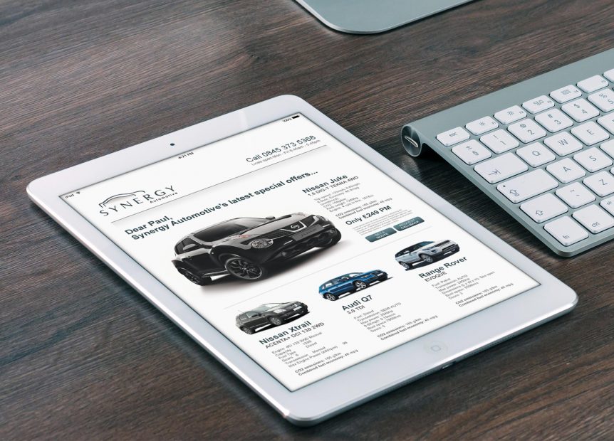
How to create a great email newsletter. It’s a sad fact that most mailouts go unread by the majority of recipients. People sign up for emails from a company, product or service they loved at the time but then lose interest. Maybe their inboxes are clogged up with too many messages and they don’t have enough time to look at them all. Instead of opening and reading, they hit the delete key – or worse, unsubscribe altogether.
Don’t despair, though – we’ve got some great ideas to make your next email newsletter more appealing…
We’ll assume you already have your distribution system in place, such as up-to-date data lists and software that will send out your newsletter and provide analytics.
What do you want to say?
The first thing you need to do is clarify your message. If you’re offering a new service, for example, you’re going to want as many people as possible to know about it so you’ll need a really eye-catching design. Your graphic design service will be able to help you with this.
If you’re sending a general newsy update, you might prefer a look that’s a little more low-key.
Choose your format
Different styles suit different messages. If you’re letting people know about a sale or special offer, you might want that to be the whole focus of your email and perhaps a flyer-type design would work better. If you’ve got several items to communicate, you’ll need a different style.
Do you want to provide a ‘view in web browser’ option, and will the newsletter appear differently on mobile and desktop versions? These are questions you can discuss with your designer to reach the right decision for your audience.
Use your own preferences
Chances are you receive third-party email updates yourself, so think about the ones you like. What entices you to open a message? If your finger skips straight to ‘delete’, why did that particular newsletter failed to hold your attention? When you’re trying to determine what will work, use your own opinions as part of the process.
Stick to the point
Too many businesses use every email newsletter as an opportunity to include as much content as possible and end up losing their main message. Don’t try to shoehorn in too many links to your website and don’t overcrowd the design. Listen to your designer when it comes to what works visually – they’re the experts. Keep your focus – there’ll be other opportunities to communicate other topics.
Be personal – but consistent
There’s nothing wrong with giving your newsletter some personality and speaking to your readers as though you were there with them. At the same time, be mindful that your newsletter should be instantly identifiable as belonging to your brand and your company. The colours and design should always reflect you and your business so make sure these are available to your graphic designer to ensure they deliver something in keeping with your image.
The header
This is one of the key design elements of your newsletter – it will be used on every mailout you send so it’s worth investing in professional graphic design support to ensure you get it right. A good header will instantly convey your brand and its values, and should make readers feel they’re receiving something special and important rather than a piece of marketing spam.
The footer
In many ways, this is as important as the header – it should round off the design and give your newsletter a feeling of completeness.
It doesn’t need to be complicated or contain too much information – contact details, social media share buttons and a way to unsubscribe are fine. It should, however, tie in with the header so once again be guided by your graphic designer to make sure the two are perfectly matched.
Don’t forget images
A newsletter containing nothing but text and headings looks dull and suggests information overload, so draw readers in with inspiring or interesting images. What you choose will depend on your message, but they could include photographs of events, staff or your product being used in unusual ways.
Images are evocative, so use those that elicit the response you’re looking for in your audience. They’re also a great way to communicate information in easy-to-absorb chunks, so if you want to share statistics about a product, for example, a bespoke infographic could be a good choice.
Offer a ‘teaser’
A product launch in six months, an exclusive subscriber offer, a big announcement…. if there’s anything happening in the future, get your readers on board for the journey. You want to get them excited about your company so that they look forward to hearing from you.
Don’t be afraid to borrow
If you see a quote that inspires you or find a useful app that helps you manage your day-to-day life, make a note of it and include it in your newsletter. It’s this kind of personal content that engages readers and reinforces that you have useful messages to share.
Stay in touch
Once you decide to send out a newsletter, you need to keep to a regular schedule. Whether it’s once a month or three times a year, if people hear from you regularly they will start to expect – and even look forward to – your newsletters. How often you do a mailout will depend on your business, but bear in mind there’s a fine line between keeping people updated and spamming them.
Don’t forget to promote your newsletter and prompt people to subscribe by having a sign-up option on your website, and share it on your social networks too.
You’ll be able to track your newsletter’s success through analytics and learn what inspired readers to take action. You’ll soon get a feel for what works and what doesn’t and be able to adapt your content and design accordingly.

