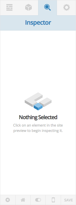
It is likely that you’ll spend the majority of your time in Cornerstone on the Inspector pane. The Inspector pane is what will allow you to tap into your elements (including sections, rows, and columns) and update their appearance to suit your design. If you’ve just come to a page and simply switch to the Inspector pane by clicking its button in the editor header, you will see the following message:
To actually begin using the Inspector, we need to first click on something in the preview area. If you read through the interface introduction article, you may recall the observer that we talked about. This is the blue outline you will see as you hover over inspectable elements in the preview area. Anytime you see this blue observer hovering over an element you’re about to click on, you will know it’s something you can interact with in Cornerstone (also take note that the blue color of the observer ties in with the same blue used throughout the Inspector pane). The observer will also give you some useful information in the label about the element you’re about to click on.
Before we move on, I wanted to make a quick note about inspecting sections, rows, and columns. Depending on the the implementation of your elements and the structure of your page, some of these elements may not be directly inspectable in the preview area; however, you will always be able to get to them through one of a few methods. Here are the various ways you can get to these elements in Cornerstone:
- Direct Inspection – As mentioned previously, you can sometimes click directly on these elements depending on how you have setup your structure and child elements. Sections are usually clickable due to their padding, but rows and columns are not always readily available due to their child elements. In that case, you’ll want to use one of the other two methods we have to get to them.
- The Layout Pane – Another way you can get to these elements is to go to the Layout pane and click on the section you’re interested in. Once you’re in there, you can inspect the current section by clicking the search icon next to the title input. Additionally, you can inspect rows by clicking the search icon on the row sortable control. Finally, you can inspect columns by simply clicking on their sortable control at the bottom of the subpane.
- Element Breadcrumbs – Finally, you can utilize the element breadcrumb path at the top of the Inspector pane to get to parent columns, rows, or sections. These appear directly below the Inspector heading and are dynamic depending on the element you’ve selected. If you click a Section, the label that is shown will simply display the title you’ve given to that section; however, as you go deeper into that section, the path upwards will be revealed. For instance, if you click a Custom Headline on a page, you will see buttons to move upwards to that element’s parent column, that column’s parent row, and that row’s parent section. You’ll see some images of these breadcrumbs in action later.
Inspecting a section
To begin, lets click on a section and see how that alters the appearance of the Inspector pane:
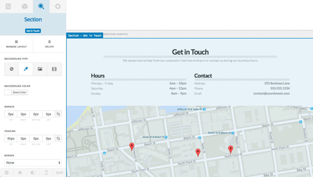
As you can see, quite a bit has changed, so we’ll take a moment to go through these items one by one. First, the “Inspector” title has been swapped out for the name of the element you’re currently inspecting (in this case it’s our “Section”). Directly below that are our element breadcrumbs. Since a section is the highest level element available, it simply acts as a label for now and gives you the title of the current section you’re inspecting.
Next we have our action buttons, which will look slightly different for sections, rows, and columns as they do for everything else. Whenever you’re inspecting any of these core structural elements, the first action will always be “Manage Layout,” which is a helpful tool for quickly focusing in on that particular element in the Layout pane. For instance, if you clicked “Manage Layout” on this section, it would instantly take you to that section’s subpane in the Layout pane. You can see how this might be super helpful if you’re on a longer page with many sections. Clicking on the same button on a row will take you to that section’s subpane but also highlight that particular row in the row sortables. This is helpful if you have a section with multiple rows, as it will take you right where you need to be with the proper row highlighted. Finally, clicking this for a column will take you to that section’s subpane with that column’s parent row highlighted. For example, if I was inspecting the first column of the second row in our example section and clicked the “Manage Layout” button for that column, it would take me here:
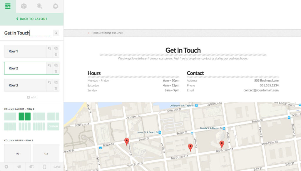
You can see that our second row of the “Get in Touch” section is highlighted for us already, so we can instantly move our columns back and forth as needed or make any other adjustments we see fit.
The next action button for sections, rows, and columns will always be a “destructive” action. So for sections and rows that means it will be a “Delete” option, and for columns it will be an “Erase” option, which will erase the contents within a column (you cannot delete columns as they are key to the structure of a page).
With all other elements that you inspect, the actions available here will always be to “Duplicate” and “Delete,” so you can use these for quickly adding lots of the same element over and over to a page, or you will need to go here to remove elements as needed.
After our actions, we have our control list. Certain elements will share similar control structures whereas others will have some that are completely unique just to them. The great thing about Cornerstone being a live builder is that you can simply play around with these controls and see what they do in real time to give you a sense of how you want things to look. Additionally, if you have any questions about a particular control and you have your Help Text turned on in your editor footer (middle button), you can hover over the label for each control and a tooltip will appear giving you a brief description of what it does. It should also be noted that at the end of the controls if you have “Advanced Controls” turned on in the editor footer, you will see inputs for CSS IDs, classes, and inline styling appear. You can use these to make fine-tuned adjustments to things as needed.
Inspecting an element
Now lets take a look at how things change when we click on one of our elements added to the page. For this, we’ll go ahead and select the “Get in Touch” Custom Headline at the top of the section:
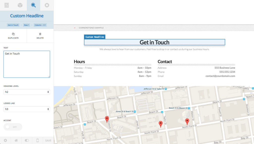
After doing that, you’ll see some things in the Inspector pane have changed once again. Our title has been swapped out to convey that we’re currently inspecting a Custom Headline. Directly below that title we can now see that we have a full path of breadcrumbs leading up to our parent section. Clicking on any of those breadcrumbs will allow you to inspect that element. So if you were to click up the path, once you select the column, that breadcrumb will disappear and only “Get in Touch” and “Row 1” would remain, and so on and so forth.
Also, our action buttons and controls have swapped out as we expect them to. We can now duplicate or delete this element, as well as alter items regarding its appearance such as the text itself, heading level, stylistic accents, et cetera. One neat thing to note when inspecting elements is that for most elements if you happen to click on text inside it, that text input will be highlighted in the editor, which we can see here. This allows you to make quick inline edits to your text without needing to always move back and forth between the preview area and the editor.