Cornerstone’s Layout Pane is where everything begins! This is where you will start by laying out your core structure in the form of sections, rows, and columns. Before we get into the actual mechanics of doing this, let’s delve a little deeper into what each of these elements do:
- Sections – The highest structural element available and can container one or multiple rows. Depending on the design you’re going for, you may be able to fit numerous rows inside a section, or you may only want to use one row. Sections can be spaced out as needed, but for the most part you will want them to stack on top of each other for a consistent page structure.
- Rows – After you’ve started off with a section, you can then add rows to that section. Rows can be spaced out from one another as needed or be stacked on top of each other.
- Columns – These are the most granular structural element available and they provide the horizontal spacing between elements. When the browser viewing your website is 767px or smaller, columns will stack on top of each other for a responsive view. Spacing between columns on these mobile view must be added as needed (more on this later).
Now that we understand some of the basics of the scaffolding that Cornerstone provides, let’s get into some practical examples.
Adding structure
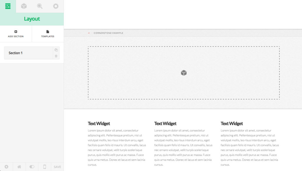
If you want to start a new page completely from scratch, the first thing you’ll want to do is add a new section using the Add Section button from the two main actions near the top of the editor (you’ll find that most panes have two main items like this at the top for important actions). Doing this will replace the Cornerstone welcome message in the preview area with a section surrounded by a dashed outline and featuring our element icon in the middle:
Anytime you see one of these areas, it is outlining a column, which is a droppable area for elements. These areas will move around depending on how you structure your output for your pages. You will also notice that not only has this new section been added to the preview area, but a sortable item has been added to the editor. These sortable items are a common facet of Cornerstone, so we’ll take a second to discuss them. Sortable items are made up of two distinct parts:
- The Handle – The large area to the left with the label that turns white on hover is known as the handle of the sortable item, and it typically has two functions. Firstly, clicking it will activate something, such as a subpane of options to appear for further adjustments or highlighting a particular element. Secondly, if you click and hold on it, you can drag the sortable item around. If you have multiple sortable items, you can rearrange them in a new order by doing this and whatever they represent will be reordered in the preview area.
- The Controls – For the most part, sortable items will have two controls that appear, which are typically duplication and deletion. In the instance of rows (which we’ll get to in a bit), there is an additional control to inspect that element just in case a user wants to get to it a little easier.
Since we only have one section for now, let’s go ahead and click the handle to take us through to our row and column management subpane.
Row & column management
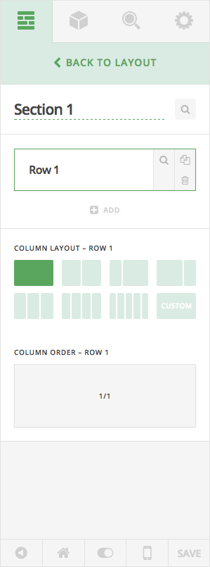
Once you’ve clicked on the handle of your section sortable item, you will see the row and column management subpane that looks like this:
As this might be your first time to click through to a subpane in Cornerstone, keep in mind that you’ll never go any “deeper” than this in the editor. If you ever need to get back to the top level of a pane, simple click the back button at the top of the pane.
Below that back button the first thing you’ll see is an input that contains the same text as the sortable control before we clicked on it. This is the title control for a sortable item and it is used to label sortables to your liking for easy recall later. The search icon to the right of the input is an inspect button for the section you’re currently on and is one of a few ways you can inspect sections as needed.
Next, we have another sortable control representing your rows. You can add multiple rows here as needed using the “Add” button below the sortable and can inspect, duplicate, or delete your row using the controls present. Clicking the handle for these rows will activate the column layout and order controls for that row below (you’ll note that active rows are highlighted green to show that they have the current focus). We’ll come back to all of this in just a bit.
Finally, at the bottom of the pane you’ll see two controls for choosing the column layout and order of the currently selected row. The Column Layout control dictates the overall structure of your row, while the Column Order control is a special kind of sortable which we will go over in a bit. When using the Column Layout control, you can use one of the seven predefined options, or utilize the Custom option, which will display an input and allow you to use additional layouts as needed. Columns cannot be any smaller than 1/6 and must add up to a whole (for instance, 1/4 + 1/2 + 1/4 would be an acceptable input). Finally, you’ll note that these controls also end in the row that is currently selected.
Altering a row’s column layout and order
Now that we have that out of the way, let’s see how to change the column layout of our row. For this example, I’m simply going to select the third predefined option, 1/3 + 2/3:
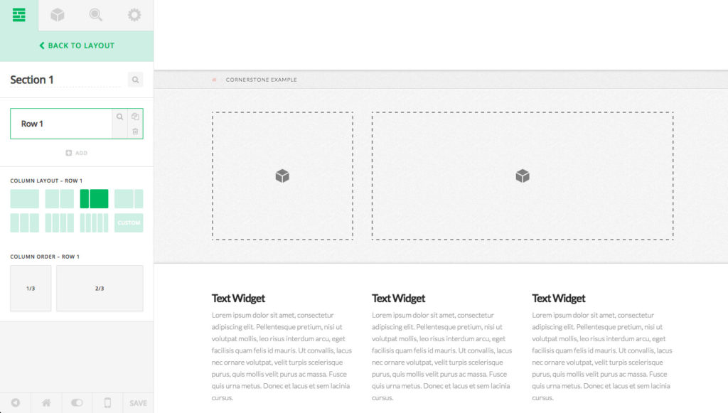
In doing this, we can see that quite a few things have changed for us throughout the builder:
- In the preview area, our single droppable area has split into two droppable areas (1/3 + 2/3 due to our selection).
- The Column Layout control is highlighting the currently selected row’s new layout.
- The Column Order control has split from a single column (i.e. 1/1) into two to represent our new layout.
So let’s say that we want to reorder this layout and use 2/3 + 1/3 instead. One way we could do this is to simply click the next predefined layout button, but let’s take a moment to play around with the Column Order control. As mentioned above, this is a special kind of sortable designed specifically for columns that is meant to visually detect the current layout of your columns. The entire column itself is a handle that can be clicked and dragged to move the ordering of the column or simply clicked to inspect that column (which we’ll cover in another article):
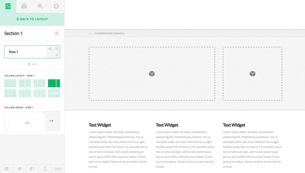
Dragging the column into its new position is reflected in the preview area after we drop the column. Altering the core structure of your page nothing more than a few clicks and you’re good to go! The same type of structure within a section can be done for rows above by dragging their position up and down, but we’ll cover this in more detail in another article (note that by default rows will stack on top of each other, but you can alter their spacing by inspecting them and changing their margins as needed).